This post extends my original LinkedIn note (in French) on a simple idea:
Don't ask for a deliverable. Ask for the logic that produces the deliverable — and keep that logic reusable, transferable, independent of the model that wrote it.
The note told a concrete story. I'd designed a LinkedIn carousel to document a personal project (WC-Ledger). The design started with one model (Fable) that, the next day, was no longer available. No problem: all the logic — the PptxGenJS generation scripts, the theme engine, the layout rules — was versioned in a repo. Another model (Opus) picked up the scripts and regenerated the carousel at the same quality, with no dependence on a specific model. The detail that changes everything: I asked for the PDF (for LinkedIn) and the editable PPTX, so the deliverable stays hand-editable.
I turned that logic into a reusable skill (carousel). This post is the receipt. Two things are worth saying up front. First, the meta point: the skill, the design system, the benchmark protocol, the metrics, and this very post were all produced by agents — no hand-writing — on personal infrastructure. Second, a language note: this write-up is in English, but the carousels you'll see are in French, because the source report is in French.
The iteration that is the point
It's tempting to jump to the benchmark and declare a winner. But the thesis isn't "my skill wins." The thesis is about a loop — observe → diagnose → fix → retest — and what you fix.
Here's the honest history of the skill:
- It was first built for content with images. The WC-Ledger carousel had screenshots; the layouts (
cover,feature,split) were designed around an image grid — text on one side, a screenshot on the other. - Then I generalised it to pure text (reports, analyses — content with no images at all).
- An intermediate version had a blind spot. On image-less content, the
featureandstatementlayouts left half-empty slides: the copy didn't grow to fill the space that had been reserved for the missing image. A headline and two lines floated over a big hole. It read as a mistake. - I caught it by eye — not from extracted text, which looked fine. The tell came from a comparison: the same model, with and without the skill. Left unconstrained, the model actually filled the space better (it reached for little cards and stat rows on its own) than my skill did, because nothing was forcing it into an image-first grid. The skill was losing to no-skill on exactly the slides that had no image.
- So I fixed the logic, once. I added a new brick to the skill —
cards: a row of titled panels with a coloured top-border — plus astatsrow usable on any text slide. Now the skill itself generates what the free models were doing spontaneously: when there's no image, carry the lower half with structured cards instead of leaving a void.
 A no-image slide carried by the
 cards brick — the fix, now part of the versioned logic.
The benchmark below runs on that corrected version. And this is the whole argument in miniature: the value of versioning the logic isn't that a skill beats a model. It's that when you spot a defect, you fix it once — in the logic — and every model that runs the skill inherits the fix. The loop is the demonstration.
The experiment
Six generations = 3 models × 2 conditions. Same source report (a deliberately clickbait-styled piece on the Netherlands at the 2026 World Cup, with an "honest" section that dismantles its own hype) and the same design system ("The Signal Brief": warm paper, terracotta accent, Fraunces + Inter + IBM Plex Mono, sharp corners).
Both inputs were generated by Claude too
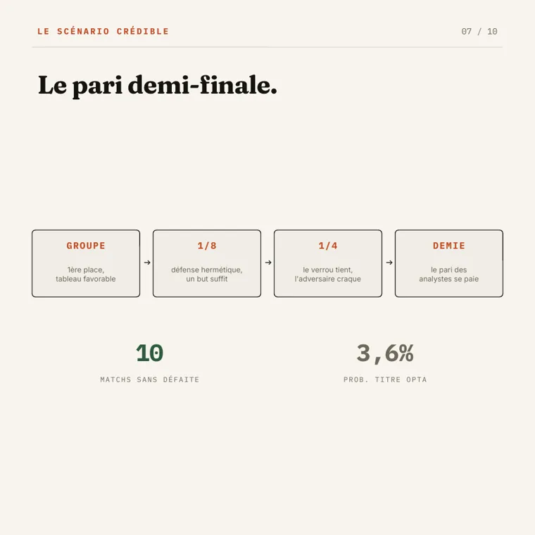
Neither input was hand-authored — which makes this a fully self-hosted, agent-made test end to end. The content is a Claude deep-research run: I asked Claude to research the Netherlands' 2026 World Cup case, and it produced the analysis — real, dated figures (four goals conceded in qualifying, van de Ven clocked at 37.12 km/h, Malen's Serie A form, Opta's dark-horse rating) wrapped in a deliberately clickbait frame, then undercut by its own honest "now let's strip the glitter" disclaimer. The report the carousels summarise is itself model-written.
The design system is generated too: a fake brand — "The Signal Brief" — invented for this test and written as a design.md. That's a machine-readable brand the model reads and applies: a YAML block of tokens (colour roles, a type scale, spacing) plus prose describing the voice and components. It's the same idea Google's Stitch team wrote up for design.md — hand the model a structured brief and it styles the output to match, instead of re-specifying the look on every request. Nothing here is a real client's brand; the point was a single, self-consistent target every run had to hit.
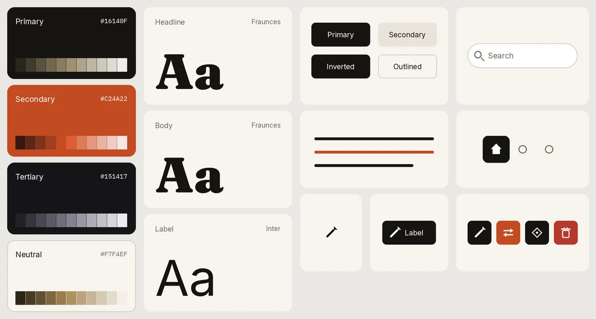 The generated brand, rendered from its
 design.md: warm paper, one terracotta accent, Fraunces for the narrative, Inter for labels, IBM Plex Mono for figures, sharp corners. Primary / Secondary / Tertiary / Neutral map to ink, terracotta, near-black, and paper.
The two conditions are not "skill vs. nothing." They are two skills:
carousel— my skill: you write onedeck.json(the what), and a theme engine applies the design's fonts and colours (the how). Editorial logic + a theme engine.pptx— Anthropic's built-in presentation skill: a model that knows how to build slides with PptxGenJS, but without my editorial logic or theme engine.
The protocol (and why it's serious)
- One isolated sub-agent per cell, each in its own working directory. In the
pptxcondition, only the two input files were copied into the agent's folder — it never sees thecarouselskill (isolation by convention). - The prompt is identical, word for word, across the three models of a condition; only the model and the directory change. Each agent first reads the
SKILL.mdof its skill. (I verified that a sub-agent does not auto-trigger thepptxskill — I had to point it there explicitly, or thepptxcondition would have been empty.) - The real model, verified — not assumed. The sneakiest trap: the
CLAUDE_CODE_SUBAGENT_MODELenvironment variable can silently override every sub-agent's model. I audited it (absent), assigned each agent's model explicitly, and — crucially — verified the identifier actually used in each sub-agent's transcript:claude-haiku-4-5,claude-sonnet-4-6,claude-opus-4-8, exactly as intended, run by run. - Measures: end-to-end wall-clock per agent, tokens (input/output/cache), build count, deliverables produced, and a visual inspection of every PDF — I rasterise each page to PNG and look, rather than trusting
pdftotext.
The results
The dashboard (measured, verified)
| Model (real) | Condition | Slides | Builds | Time | Tokens (Σ, subscription) | QA sub-agents | Fonts | Quality /10 |
|---|---|---|---|---|---|---|---|---|
claude-haiku-4-5 |
carousel | 10 | 2 | 81 s | 1.64 M | 0 | brand ✓ | 9.0 |
claude-haiku-4-5 |
pptx | 9 | 2 | 118 s | 1.56 M | 1 | brand ✓ | 7.0 |
claude-sonnet-4-6 |
carousel | 10 | 5 | 480 s | 5.47 M | 0 | brand ✓ | 9.0 |
claude-sonnet-4-6 |
pptx | 7 | 3 | 853 s | 5.37 M | 4 | substituted ✗ | 6.5 |
claude-opus-4-8 |
carousel | 11 | 2 | 353 s | 4.33 M | 0 | brand ✓ | 9.5 |
claude-opus-4-8 |
pptx | 10 | 2 | 604 s | 4.96 M | 1 | brand ✓ | 9.5 |
Tokens = per-message sum of the four components (input + output + cache_read + cache_creation), ccusage-style. All 57 slides are in the gallery.
Time: the pptx condition is markedly slower
For every model, building the carousel with the pptx skill is slower than with carousel: Haiku ×1.45 (118 vs 81 s), Sonnet ×1.78 (853 vs 480 s), Opus ×1.71 (604 vs 353 s). Two reasons, visible in the transcripts:
- The
pptxskill mandates visual-QA sub-agents. Thepptxruns spawned 1 (Haiku), 4 (Sonnet), and 1 (Opus) nested QA sub-agents. Thecarouselruns review the PDF inline: zero sub-agents. That's a lot of round-trips removed. - Hand-building vs. data-driven. In
pptx, the model writes and debugs layout code (Sonnet: 5 builds; one agent even had to reorder OOXML XML). Incarousel, it fills adeck.jsonand a proven engine renders it.
Sonnet on pptx is the extreme: 14 minutes and 4 QA sub-agents for 7 slides.
Tokens: it's mostly the model, not the condition
At a given model, both conditions consume comparable amounts. The big lever is the model: Haiku ~1.6 M, Opus ~4.5 M, Sonnet ~5.4 M (Sonnet iterated the most — 130 messages for its carousel). Caveat: these totals are inflated by agentic cache_read — every turn resends the context, mostly from cache; the generated (output) tokens are tiny (169 to 2,388).
Quality on screen — where it's decided
Answer to Q1 (model independence): yes. The three carousel decks land at 9.0–9.5 (spread 0.5). The three pptx decks spread across 6.5–9.5 (spread 3.0). The skill compresses the variance: it encapsulates the narrative arc, the anti-"half-empty slide" rule (the fix above), and guarantees fonts and colour roles via its theme engine. Haiku driven by the skill lands near Opus.
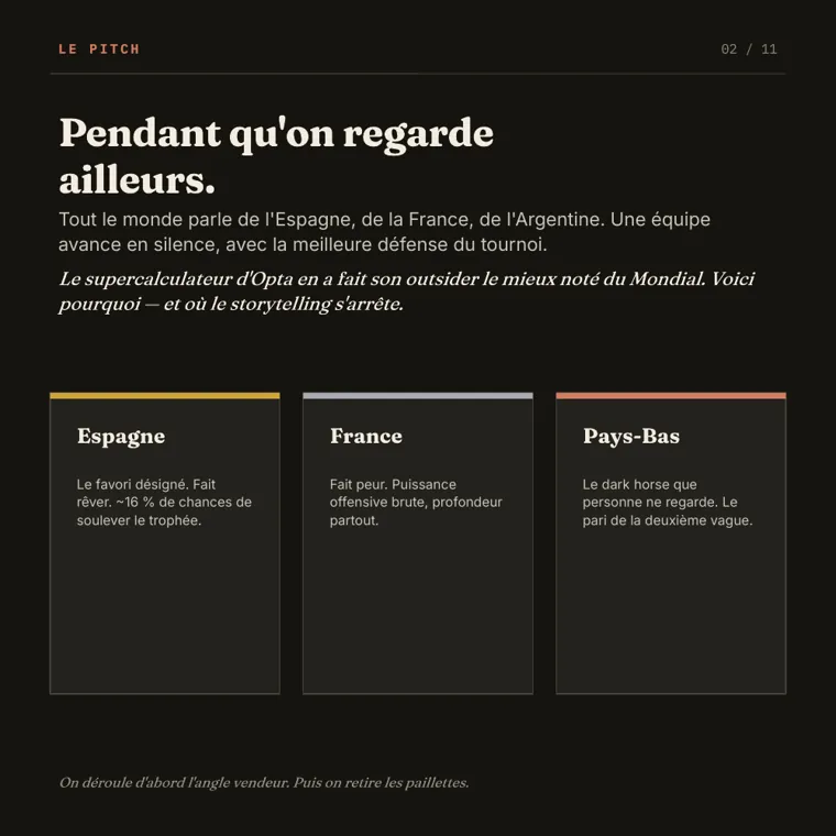
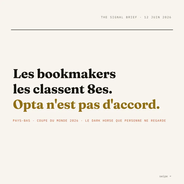 Opus + carousel — a contrast hook (bookmakers rank them 8th; Opta disagrees).
Answer to Q2 (small model + skill vs. big model + generic): yes, and it wins on several axes. Haiku + carousel (9.0, 81 s, 1.6 M tokens, brand fonts guaranteed, 0 sub-agents) beats Sonnet + pptx (6.5) and Haiku + pptx (7.0), and matches Opus + pptx (9.5) — which needed 604 s + a QA sub-agent + an OOXML repack to get there.
What made the difference on screen:
- Fonts. The
carouselengine downloads and applies Fraunces / Inter / IBM Plex Mono: fidelity guaranteed across all three models. Inpptxit's left to the model's judgement — and it was Sonnet, the "smartest" model, that drifted: it followed thepptxskill's generic "use QA-safe fonts" advice and swapped all three brand fonts for Cambria / Arial / Courier New. Haiku took the design literally and kept the real fonts. Opus went further and arbitrated in favour of the design system (brand fonts, sharp 0px corners, cards with a 1px terracotta top-border, italic pull-lines) where thepptxskill recommended the opposite.
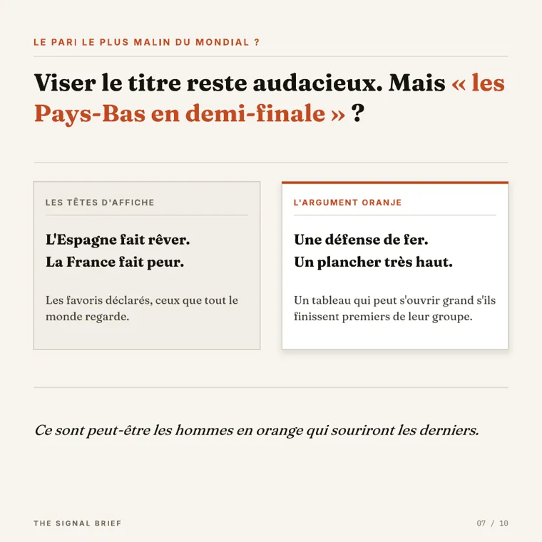 Opus + pptx — design-system specs implemented by hand: sharp corners, 1px top-border card, italic pull-line.
- Half-empty slides — the very defect the iteration fixed. I still found it, moderate, on both sides: Sonnet +
carouselleft an empty band on itsstepsslide (body removed to fix an overlap); Opus +carouselleft its dark pivot slide half-empty (a defensible section break, but under-filled). Worth noting: Opus +carouselproactively fixed a different empty slide during its own review — exactly the behaviour thecardsbrick is meant to systematise.
 Sonnet + carousel — a residual empty band: the defect is rarer now, not extinct.
The "QA by text" trap. In
pptx, one agent claimed text rendered "grey" in the PDF (a LibreOffice substitution) but would be faithful in PowerPoint. Looking at the PDF, the contrast was perfectly fine. The PDF is the LinkedIn deliverable: you judge what's on screen, not the PowerPoint promise.Sharp corners. A nuance that flatters no one: the design asks for sharp (0px) corners. The
carouselengine applies colours and fonts but not the corner radius → itsstepscards come out rounded. On thepptxside, Haiku and Sonnet dropped a decorative circle (off-spec); only Opus +pptxhonoured the sharp corners. Neither approach honours that token perfectly — a clear lead for the skill's next version.
What it says about the idea
"Version the logic, not the deliverable" holds — and the numbers say where.
Where the skill helps. It transfers quality from one model to another. The editorial logic (hook, arc, anti-void) and the theme engine (fonts + colours guaranteed) let a small, fast, cheap model produce an on-brand, reliable deliverable — while a generic model, even an excellent one, can drift off-brand (Sonnet and its fonts) or cost ~7× the time for the same result (Opus +
pptx: 604 s + a QA sub-agent vs. 81 s inline for Haiku +carousel). It's exactly the story from the LinkedIn note: Fable gone, Opus picks up the logic, same result. The deliverable follows the logic, not the other way around.Where the skill constrains. The engine imposes its layouts. It doesn't (yet) apply the design's corner radius; its
stepsslide can leave a void if you strip its body. A model that's very strong on the generic skill (Opus +pptx) can, conversely, hug a precise spec more tightly (1px top-borders, pull-lines) — at the cost of time, tokens, and reproducibility across models.
So the lesson isn't "the skill beats the big model." It's: the skill makes the result independent of the model. It trades a little ceiling (what a bespoke Opus run would hand-craft) for a lot of floor, speed, and consistency — plus a dual deliverable, PDF + editable PPTX, every time. To publish every week without depending on the model of the day, that's exactly the right trade.
And the meta detail that validates all of it: this experiment itself ran on three models, and the measuring, isolation, and verification logic was versioned and reproducible. The deliverable — this post — followed.
Honest limits, restated: the token figures come from the Claude Code subscription, not from a single API call's usage (they include all the agentic work, so they're a fair end-to-end cost in this harness, not a minimal API cost); total_cost_usd per sub-agent isn't exposed here, so it isn't reported. One run per cell (no averaging). Isolation is by convention, not a hard wall. The unhonoured "sharp corners" token is the headline lead for v4.